SingFinance unveils new logo and shorter name
The brand will now be known as SingFinance.
Sing Investments & Finance Limited has announced a brand refresh which will see the brand adopt a shorter name and a new logo.
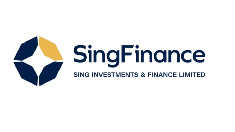
Now to be known as SingFinance, the company’s new logo will feature a gemstone, symbolising trust and simplicity, made up of four hexagons that come together to form a robust octagon of strength and unity.
The middle of the new logo is a star, reminiscent of the original star of the old logo. The colour will be blue for confidence, trust, and valour whilst gold symbolises prosperity and the future.


![SBR 5 Lorem Ipsum News 2 [8 May]](https://cmg-qa.s3.ap-southeast-1.amazonaws.com/s3fs-public/styles/exclusive_featured_article/public/2025-05/a_hand_pointing_to_a_futuristic_technology_5b87c9d0e3_3.png.webp?itok=M3Hf-9XR)
![SBR 4 Lorem Ipsum [8 May Top Stories]](https://cmg-qa.s3.ap-southeast-1.amazonaws.com/s3fs-public/styles/exclusive_featured_article/public/2025-05/a_hand_pointing_to_a_futuristic_technology_5b87c9d0e3_2.png.webp?itok=2m5Wl0MX)


![Exclusive three SBR 12 Lorem Ipsum [8 May]](https://cmg-qa.s3.ap-southeast-1.amazonaws.com/s3fs-public/styles/exclusive_featured_article/public/2025-05/a_hand_pointing_to_a_futuristic_technology_5b87c9d0e3_11.png.webp?itok=8kn_UIfA)
![SBR 3 Lorem Ipsum [ Exclusive 2]](https://cmg-qa.s3.ap-southeast-1.amazonaws.com/s3fs-public/styles/exclusive_featured_article/public/2025-05/a_hand_pointing_to_a_futuristic_technology_5b87c9d0e3_1.png.webp?itok=YCyjLegJ)
![SBR 2 Lorem Ipsum [8 May]](https://cmg-qa.s3.ap-southeast-1.amazonaws.com/s3fs-public/styles/exclusive_featured_article/public/2025-05/a_hand_pointing_to_a_futuristic_technology_5b87c9d0e3_0.png.webp?itok=_cKD-29o)

![Video [Event News]](https://cmg-qa.s3.ap-southeast-1.amazonaws.com/s3fs-public/styles/event_news_featured_article/public/2025-05/screenshot-2025-05-08-at-4.58.53-pm_0.png.webp?itok=Kud35sMs)
![Event News SBR 9 Lorem Ipsum [8 may]](https://cmg-qa.s3.ap-southeast-1.amazonaws.com/s3fs-public/styles/event_news_thumbnail/public/2025-05/a_hand_pointing_to_a_futuristic_technology_5b87c9d0e3_8.png.webp?itok=DTh_dbYp)
![Event News SBR 9 Lorem Ipsum [8 May]](https://cmg-qa.s3.ap-southeast-1.amazonaws.com/s3fs-public/styles/event_news_thumbnail/public/2025-05/a_hand_pointing_to_a_futuristic_technology_5b87c9d0e3_7.png.webp?itok=vzDAzb6V)
![Event News SBR 8 Lorem Ipsum [8 May]](https://cmg-qa.s3.ap-southeast-1.amazonaws.com/s3fs-public/styles/event_news_thumbnail/public/2025-05/a_hand_pointing_to_a_futuristic_technology_5b87c9d0e3_6.png.webp?itok=jvHFc4P6)
![Video [Event News]](https://cmg-qa.s3.ap-southeast-1.amazonaws.com/s3fs-public/styles/video_thumbnail/public/2025-05/screenshot-2025-05-08-at-4.58.53-pm_0.png.webp?itok=yZnI0YBb)
![Video 1 SBR [8 May]](https://cmg-qa.s3.ap-southeast-1.amazonaws.com/s3fs-public/styles/video_thumbnail/public/2025-05/screenshot-2025-05-08-at-4.58.53-pm.png.webp?itok=9AAeRz_k)

 Advertise

